Total subscribers (email and RSS combined) = 95 (up from 60 a year ago)
Page views since this time last year = 15,933
Posts for the year = 34 (down from 40 in 2009)
Blank pages remaining in main sketchbook = 2, which I'm saving till the very end.
Happy New Year everyone.
Friday, December 31, 2010
Saturday, December 18, 2010
A landmark

Untitled (Free), mixed media on board, 50 x 75 cm
On Wednesday this week, after two intense years, I sent the last assignment of OCA's Painting 3 Advanced to my tutor. It's the last course for the degree, so this marks the end of that phase (still have the assessment process to get through). I often felt this point would never come, that I wouldn't make it or would be unable to finish the course for one reason or another, life catching up and so on. It's a relief to have got here.
In the OCA system you finish up with a programme of study that you design yourself, which is supposed to take a year. I underestimated how much time my course would need and it stretched to two full roller-coaster years. I've alienated a few friends and neglected or postponed numerous things along the way in a single-minded drive to get it done. It would have been a waste not to finish the job after investing the first four years, but I didn't expect it to take so long or to take over my life the way it did.
I had put in a link to a folder of some work but after reflection have taken it out again. In the OCA system a tutor comments on the assignments as you go along, but no marking is done and no grades are given until the final assessment, that is, after the course is finished, so I am rather nervous about this lot, only too well aware that it may fall short of what is required. It will be a bit of a nail-biter but I will let you all know how it goes, one way or the other.
Thursday, December 9, 2010

Thursday, November 25, 2010
Saeki, Clarke and Feelings

A drawing by Hiroe Saeki
There was an exquisite drawing (not the one above) in the Royal Academy summer show that I found fascinating and beautiful, by Hiroe Saeki. I can't remember the actual drawing but I remember that it was highly detailed, with clean execution and a lot of pristine white paper around it, which is a feat in itself as anyone knows who does a lot of pencil drawing. Looking her up further, she's a Japanese artist who makes her drawings from imagination and nature. They have a meditative quality, sometimes whimsical. I wouldn't mind having one on my wall, one could get lost in it. They remind me a little bit of Leroy Clarke's intricate pen drawings. I recall on a visit to the National Museum not too long ago being wowed by Leroy's drawings again, and also marvelling at how well the paper had held up, with no mottling or discolouration. This poster showing Leroy's style of drawing is on the website of Bloomsbury Auctions. It may have browned over time since a poster wouldn't be printed on archival paper.

Poster for Leroy Clarke's 1972 exhibition in New York.
Image from Bloomsbury Auctions
"82. Tom FEELINGS (1933 - 2003). Collection of personal sketchbooks, early comic book designs, drawings and paintings. Includes: 17 sketchbooks both partially and fully completed, comic book designs, family portraits including a picture made at 6 years old and a painting of the artist’s aunt and drawing of his mother, other early drawings, studies and sketches.
est. $700 – $1000
Sold for $650
Sale NY040, 9th December 2009"
Sale NY040, 9th December 2009"
Monday, November 22, 2010
Christo and Jeanne-Claude

A drawing for Surrounded Islands, 1982, Biscayne Bay, Florida, in two parts
Details at http://christojeanneclaude.net/si.shtml
Nobody can buy these projects.
Nobody can own these projects.
Nobody can charge tickets for these projects.
Even we do not own these projects.
And later, about The Gates, "It touches people. And it makes people happy."
(Jeanne-Claude died last year.)
http://christojeanneclaude.net/index.shtml
.
Sunday, November 7, 2010
Paul Henry, Irish landscape painter
Paul Henry (1876 -- 1958) was an Irish painter who specialized in paintings of the west of Ireland and who was popular during his lifetime. We had one of his paintings at home and I used to love looking at it. I still love his work, the way he saw and painted the greys which are so characteristic of Ireland's rainy landscapes, his "pale view of hills". To me he is a painter who had something to say. He studied art in Belfast and Paris and is described as a Post-Impressionist on the Encyclopedia of Irish and world Art. I made this little gouache copy of Rain on the Bog and while doing it marvelled at how economically he achieved his effects. Then again he painted landscapes like this over and over during his working life and must have known them off by heart in the end.
 |
| After Paul Henry, Rain on the Bog (a fair copy though I say so myself). |
The original of Rain on the Bog is an oil on canvas, 35.5 x 40.5 cm or 12 x 16" approx.
.
.
Thursday, October 28, 2010
Peter Doig: It has to feel like it's meant
Heidi Zuckerman: [sweetly] So what are some of the complications of making a painting?
Peter Doig: [hesitant] -- I don't know . . . For me . . . it has to be convincing . . . that's got nothing to do with good drawing, bad drawing . . . bad painting, good painting . . . it has to feel like it's meant, in a way . . . hard to describe I mean because sometimes that can happen quite quickly . . . sometimes it can happen over a long period of time . . . it's very complicated . . . I think that as soon as you're shallow it's very apparent . . . have to try harder . . . not got anything to do with hard work or anything . . . it's just like a very very subtle thing, it's not really . . . it's kind of not in tune, it's like, you know, a piece of music even if it's discordant it's right, you know? Very hard to describe. The complications are purely between you and the work.
Transcribed from the fascinating Doig-Zuckerman interview
http://www.youtube.com/watch?v=Hbr28EeTCq8
Wednesday, October 20, 2010
Josef Albers, Interaction of Color
I've been reading Interaction of Color by Josef Albers (1888 - 1976) and doing some of the exercises. I like the book a lot. It's not dogmatic, rather he takes an enquiring approach, suggesting experiments that can be made to explore different colour interactions. The experiments are open-ended and can be extended in umpteen ways to suit oneself. Don't know how I've managed to miss this book for so long and can see why it's still so popular.

Josef Albers, Interaction of Color, revised and expanded edition 2006. Yale University Press, New Haven & London. Originally published in 1963.

In this exercise I was trying out one colour on different backgrounds to suggest 'Young' (above) and 'Old' (below). I bent the rules a little by altering the quantities and shapes.
Josef Albers, Interaction of Color, revised and expanded edition 2006. Yale University Press, New Haven & London. Originally published in 1963.
Tuesday, October 12, 2010
UK sketchbook
For want of something to post, two pages from the UK section of my sketchbook:


In Kensington Gardens (graphite, A5)

Wildflowers in North Wales (pen, A5)
Tuesday, October 5, 2010
A weird installation

I forgot to mention an installation at the Saatchi Gallery. This was Richard Wilson's 20:50. I'd heard about it and had read recently that it shouldn't be missed, so made a separate trip just before leaving. I'm still puzzled by it, still don't understand how it's made and how it works. When you go in there (it's in one of the basement galleries) -- you stand at floor level looking down into the basement which is at a lower level. It appears to be a huge empty room with the ceiling far above your head and the floor far below, with something odd and unnerving about it. I don't have the words even to describe it. The lower part of the room is evidently filled with oil, which stays perfectly still, not the slightest ripple. It looks like air, which sounds impossible. There's a faint smell of oil but no sign otherwise. The seemingly unsupported walkway leading out into the middle had a rope across it to indicate no entry. Looking at the photo now, I'm wondering how they dust the window ledges, because evidently the installation is permanent and has been there for a couple of years. It just boggles the mind.
Monday, September 13, 2010
Back home now
Back home now and have just remembered that I didn't post anything last week, after posting once a week while on holiday which is way higher than my usual rate. It was because of all the museum and gallery visits, and the opportunity to write them up -- not something I really enjoy doing but it's advisable for the logbook.
In the second-to-last week I made a day-trip to Liverpool to the Walker Gallery to see Peter Doig's Blotter. The gallery was quiet and I spent an hour and a half with the painting, to my own surprise. I wouldn't normally do that to see just one painting but it was necessary because my essay is on him. Tate Britain has two of his paintings, Echo Lake and Ski Jacket, but unfortunately they're in storage, not on display. I applied for an appointment to see them but didn't hear back before leaving. So it was the Walker or nothing. I'm glad I went, the trip was well worth the time and effort. (The painting is under glass, the diagonal green line at upper left of the photo is a reflection of the gallery lights).

The last week was hectic in other ways. I met an OCA buddy, we talked for four hours solid. Absolutely the way to go for isolated distance-learning students out there, online doesn't do it at all. This was the fourth or fifth time I'd met a fellow student in person, after making contact through the website, and it just makes a huge difference and is worth going out of one's way for. Even to another city. So a big hi to my OCA buddies, it was wonderful meeting you all and hope it's not too long before we meet again.
The last item was a return visit to the British Museum to see the Parthenon marbles. You might think one would be jaded after seeing so much art over the eight weeks, but no . . . they are so incredible, so moving, it was the best possible way to end a fantastic trip.
In the second-to-last week I made a day-trip to Liverpool to the Walker Gallery to see Peter Doig's Blotter. The gallery was quiet and I spent an hour and a half with the painting, to my own surprise. I wouldn't normally do that to see just one painting but it was necessary because my essay is on him. Tate Britain has two of his paintings, Echo Lake and Ski Jacket, but unfortunately they're in storage, not on display. I applied for an appointment to see them but didn't hear back before leaving. So it was the Walker or nothing. I'm glad I went, the trip was well worth the time and effort. (The painting is under glass, the diagonal green line at upper left of the photo is a reflection of the gallery lights).

Peter Doig, Blotter, oil on canvas, Walker Gallery, Liverpool.
The last week was hectic in other ways. I met an OCA buddy, we talked for four hours solid. Absolutely the way to go for isolated distance-learning students out there, online doesn't do it at all. This was the fourth or fifth time I'd met a fellow student in person, after making contact through the website, and it just makes a huge difference and is worth going out of one's way for. Even to another city. So a big hi to my OCA buddies, it was wonderful meeting you all and hope it's not too long before we meet again.
The last item was a return visit to the British Museum to see the Parthenon marbles. You might think one would be jaded after seeing so much art over the eight weeks, but no . . . they are so incredible, so moving, it was the best possible way to end a fantastic trip.
Sunday, August 29, 2010
Surprises at the Courtauld

Master of Flémalle (Robert Campin?), Triptych with the Entombment,
the Resurrection and a donor, c. 1420, ? oil and gold leaf on panel.
the Resurrection and a donor, c. 1420, ? oil and gold leaf on panel.
Once again the Courtauld Institute Art Gallery has produced a surprise, for me anyway. The gallery is in Somerset House on the Strand (it was in Portland Place the last time I was there in the early 1980s, more on that later). The surprise on this occasion was the Gothic and Early Renaissance collection in a room on the ground floor. This era of painting has never appealed to me before but somehow my mind got changed. The paintings, small and tightly painted on panels, are beautiful as objects, exquisitely wrought with delicate textures, and the way they were displayed brought this out. There were several altar pieces and predellas, triptychs on hinged panels, absolutely beautiful and perfectly preserved. This room made the visit well worth while.
The only previous visit about twenty-five years ago was surprising too. I had gone specially to see Cézanne's Card Players, which was just as I'd imagined, but near to it there was a large Van Gogh of a tree in blossom which just knocked me over. It might have been a peach tree, what I remember is that it was a close-up of a tree with pinkish-white blossoms, quite large, maybe 24 x 30 ins or 30 x 40, and it was as if it was alive, shimmering and hovering in the air, a gasp-inducing painting. It had looked so dull in the book and the contrast showed me once and for all how necessary it is to see paintings in real life whenever possible.
I've been wondering if it would still have the same effect and expected to find out on this visit, but sad to say the van Gogh painting I remember is no longer there. After coming home I checked their website and there's no record of it. Did I make a mistake? I don't think so. The Courtauld was the only gallery I went to on that occasion, and the experience was particularly vivid and memorable.
Whatever about that, the gallery still has an interesting Impressionist and Post Impressionist collection which includes Renoir's La Loge and Manet's Bar at the Folies Bergéres, also quite a few Cézannes. They have a small Picasso still life painting, about the least interesting I've ever seen. They've also been adding contemporary prints by the thousand, mostly donated. In addition there's a lot of Rubens and a display of silver. But for me the stars of the show were the pre-Renaissance paintings in Room 1.
Monday, August 23, 2010
Alice Neel

Alice Neel is to my mind one of the greatest artists of the twentieth century, so it was a thrill to find a major show of her work on at the Whitechapel Gallery in London (until Sept 17, 2010). I loved the show, every bit of it. Many of the great paintings that I know are there -- Nancy and Olivia, Hartley (her son, arms casually behind head), Meyer Schapiro, Andy Warhol, an Irish trade unionist banging his fist on the table, her nude self-portrait at the age of eighty. All just pure, pure pleasure. Loads of others too that aren't so well known, but will be. The twins dressed in red pinafores is an amazing painting, I can go on looking at it for ages. I'd have bought the book there and then but it's heavy to cart back to Trinidad. At some stage I will get it. There's an award-winning film by Neel's grandson accompanying the show, well worth watching. Overall, I just can't do her justice, so I've collected a set of reviews, each of which adds something to the mix. These are:
- Review by Adrian Searle in the Guardian -- http://www.guardian.co.uk/artanddesign/gallery/2010/jul/08/alice-neel-whitechapel-gallery-art-exhibition
- Charles Darwent in the Independent -- http://www.independent.co.uk/arts-entertainment/art/reviews/alice-neel-painted-truths-whitechapel-art-gallery-london-2029051.html
- Laura McLean-Ferris in the Independent -- http://www.independent.co.uk/arts-entertainment/art/reviews/alice-neel-painted-truths-whitechapel-gallery-london-2025769.html
- Richard Dorment in the Telegraph -- http://www.telegraph.co.uk/culture/art/art-reviews/7911011/Alice-Neel-Painted-Truths-at-the-Whitechapel-Gallery-review.html
- Robin Blake at FT.com -- http://www.ft.com/cms/s/2/89945048-8b78-11df-ab4d-00144feab49a.html
Sunday, August 8, 2010
National Gallery, unedited notes from a short visit
Crowds of people. I went only to the rooms with late 19th -- early 20th century painting, and to the exhibition of children's work in the basement. Some notes:
Toulouse-Lautrec – Portrait of Emile Bernard, 1886. Dead on drawing. Bernard is a little boy.
Van Gogh's Mother by a Cradle 1887 – lively surface – the hatching really does animate it.

Van Gogh – Chair – visibly raised ridges of paint.
Van Gogh – Farm Near Auvers – not as good as reproduction – thin, paler, smaller than expected.
Van Gogh – Wheatfield with Cypresses, 1889 – don't know this one, lovely composition, very bright and alive – but is it rather too neat? (under glass)
Picasso's Child With a Dove – under glass, 1901, nice surface.
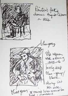
The Cezanne Old Woman With A Rosary – great because of abstract patterns of light, dark and colour, + sense of depth.
Renoir, The Umbrellas. This was popular culture, but upmarket. Such great drawing – every hand, every foot (except one?)
Manet – Corner of a Cafe – horrible drawing of man's left arm (blue smock).
Ingres – Monsieur de Norvins, 1811-12 – large black area perfectly varnished, not sunk or uneven.
Toulouse-Lautrec – Portrait of Emile Bernard, 1886. Dead on drawing. Bernard is a little boy.
Van Gogh's Mother by a Cradle 1887 – lively surface – the hatching really does animate it.

Van Gogh – Chair – visibly raised ridges of paint.
Van Gogh – Farm Near Auvers – not as good as reproduction – thin, paler, smaller than expected.
Van Gogh – Wheatfield with Cypresses, 1889 – don't know this one, lovely composition, very bright and alive – but is it rather too neat? (under glass)
Picasso's Child With a Dove – under glass, 1901, nice surface.
The Cezanne Old Woman With A Rosary – great because of abstract patterns of light, dark and colour, + sense of depth.

Renoir, The Umbrellas. This was popular culture, but upmarket. Such great drawing – every hand, every foot (except one?)
Manet – Corner of a Cafe – horrible drawing of man's left arm (blue smock).
Ingres – Monsieur de Norvins, 1811-12 – large black area perfectly varnished, not sunk or uneven.
Sunday, August 1, 2010
Architects build small spaces at the V&A
at the Victoria and Albert Museum
15 June – 30 August 2010
The theme for the seven architects who built the exhibits for this show was “retreat”. As the brochure says, “The starting point for these experimental projects is the idea of a small enclosed space representing an escape from the chaos of urban life to an area of peace, contemplation, shelter or creativity” This sounds lovely and it was interesting to see all the different interpretations.
One of the exhibits was a book-lined wooden staircase with a recessed fur-covered seat half-way up, a lovely idea. Unfortunately it swayed and felt slightly insecure when I was in it, which defeated the purpose I thought. An exhibit in the Cast Court was from India and showed clever use of the long narrow spaces between buildings. These are often used as dwellings. The architects made a replica of one actual structure which had been built around a large tree and they retained this feature, making a cast of the tree growing up through the building. A little hidey-hole in the interior lit by a dim red lamp gave a feeling of solitude and peace. I was not brave enough to go to the upper level, the stairs were narrow and steep with a vertical handrail. Going up would have been okay but I began to wonder about getting back down and thought better of it.
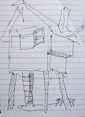
The Japanese “Beetle's House” was actually more like a tree house. It had pleasing proportions and was painted all in black on the outside, Access to the inside was by a ladder. People who saw inside were saying that it contained a little tea set and a painting, or materials to make a painting. It sounded like an idyllic retreat.
In the Architectural Gallery on the 4th floor, posters setting out the concept and scale models were on display for all nineteen submissions that the seven were chosen from.
The best came last – this was the American exhibit, a simple wooden shed. It was solidly constructed and felt totally secure and stable. The two ends were open. The designers had made a light for the back (tallest) wall in the shape of a vine, with bulbs like flowers on the end of each branch. It was really lovely, very simple and effective and for some reason deeply pleasing. It topped off the show nicely and made me glad I'd seen it.
15 June – 30 August 2010
The theme for the seven architects who built the exhibits for this show was “retreat”. As the brochure says, “The starting point for these experimental projects is the idea of a small enclosed space representing an escape from the chaos of urban life to an area of peace, contemplation, shelter or creativity” This sounds lovely and it was interesting to see all the different interpretations.
One of the exhibits was a book-lined wooden staircase with a recessed fur-covered seat half-way up, a lovely idea. Unfortunately it swayed and felt slightly insecure when I was in it, which defeated the purpose I thought. An exhibit in the Cast Court was from India and showed clever use of the long narrow spaces between buildings. These are often used as dwellings. The architects made a replica of one actual structure which had been built around a large tree and they retained this feature, making a cast of the tree growing up through the building. A little hidey-hole in the interior lit by a dim red lamp gave a feeling of solitude and peace. I was not brave enough to go to the upper level, the stairs were narrow and steep with a vertical handrail. Going up would have been okay but I began to wonder about getting back down and thought better of it.
The Japanese “Beetle's House” was actually more like a tree house. It had pleasing proportions and was painted all in black on the outside, Access to the inside was by a ladder. People who saw inside were saying that it contained a little tea set and a painting, or materials to make a painting. It sounded like an idyllic retreat.

A rough sketch of the Beetle's House
In the Architectural Gallery on the 4th floor, posters setting out the concept and scale models were on display for all nineteen submissions that the seven were chosen from.
The best came last – this was the American exhibit, a simple wooden shed. It was solidly constructed and felt totally secure and stable. The two ends were open. The designers had made a light for the back (tallest) wall in the shape of a vine, with bulbs like flowers on the end of each branch. It was really lovely, very simple and effective and for some reason deeply pleasing. It topped off the show nicely and made me glad I'd seen it.
Monday, July 26, 2010
The Royal Academy Summer Exhibition 2010
With more than 1200 pieces of work, the Royal Academy Summer Exhibition of 2010 was just too big to see it all. After maybe 300 pieces I was tired and wanted to go home but at £6 for admission a second visit was not an option, so I just lingered over the works that caught my eye or that were surprising in some way.
These included Gillian Ayres's colourful Modernist-type paintings. I knew nothing of her work before and immediately liked its freshness and her colour sensibility. Six large new vigorous paintings at the age of 80 says a lot, that's a born painter for sure. Photographs were not allowed so this tiny sketch of her biggest piece in a blank half-page of my catalogue will have to do:

The best surprise was a vast landscape by Anselm Kiefer called Einschüsse. The overall impression was of a grey, white and black landscape with strong perspective and mountains in the background, with scattered pink and red blotches like blood. There was a bench opposite the painting and I stayed there looking at it for ages. When I went to study it up close my seat was quickly taken.
In Room IX, David Hockney showed some large and beautiful photographs of trees in Yorkshire at different times of year. I have no notes on any of the other works in that room, perhaps because of exhaustion or perhaps Hockney's photos stole the show.
I liked the work of Stephen Chambers, neatly executed strange paintings and prints with a touch of humour. Others that I noted in the margins of the catalogue were Barbara Rae, Scottish contemporary abstract painter; Matthew Collings and Emma Biggs (spotted and identified from a distance); Hughie O'Donaghue (large strong abstracts); Sonia Lawson (small semi-abstract oils); Georg Baselitz (international star); an exquisite pencil drawing by Hiroe Saeki; Skein by Roderick Coyne; and an acrylic of an enlarged sketchbook page by Luciana Meazza.
Not having been to an RA Summer show before, I wasn't expecting to see so much work by the stars and this in fact made the show for me. It was a great opportunity to see some highly-rated work at first hand. Apart from these I saw only a fraction of what was there. It would have been nice to spend more time with the prints, of which there were several hundred stacked up to the ceiling, and likewise the small paintings, but after three hours I didn't have the stamina.
After the show I looked up some other reviews and could hardly find a good word said about it. So it goes with large open juried shows wherever you are in the world, they're always a mixed bag. The need for such shows is well established though, for many reasons, not least the need for a place for new artists to try their luck and get experience with serious exhibiting.
Finally, the ban on photography was in contrast to the Saatchi Gallery. Surely the publicity to be gained by photographs appearing in newspapers and on the internet far outweighs any risk of loss from copyright infringement? Wish I could have posted a photograph of Stephen Chambers' work up there, or any of countless others, because in this context a picture really is worth a thousand words.
Saturday, July 24, 2010
British Art Now at the Saatchi Gallery
I went to British Art Now at the Saatchi Gallery on Saturday July 17, 2010. There's something about this particular gallery that I really love – it might be the large light well-proportioned spaces which are exceptionally inviting and pleasurable to be in. Cameras are allowed which is nice. I bought a copy of the Picture by Picture Guide which costs £1.50 and which is incredibly helpful, with b/w images and background information about each work.
The works on show are many and varied, from the large experimental oils of Alastair MacKinven who had an impressive range of work on display, to the sawn-up sculptures of Mark Pearson. Hurvin Anderson's large paintings could have been influenced in part by Peter Doig. Iain Hetherington paints a series of life-size baseball caps surrounded by abstract dabs and splashes of contrasting colour; The series, called Diversified Cultural Worker, brought to mind Hans Hoffmann's push/pull spatial theories.
There's a good deal of sculpture which I didn't study closely, being mainly interested in the paintings, but some of it was quite inspiring, especially the oversized work of Karla Black who chooses her media for tactile aesthetic appeal. The huge weird Nothing Is A Must (2009), made of chalked sugar paper, was especially interesting.
Another painter whose work I liked was Phoebe Unwin. Two that stand out are Girl (2005), a strong half-length profile study in muted tones with some lovely textural painting in the girl's jumper, and Soft Person (2008), a large beautifully executed abstract in gold leaf and acrylic which reminded me of Gustav Klimt in its intricate patterning.
Two artists hark back to the distant past in their work. Ged Quinn based his large oil paintings on landscapes by Claude Lorrain, introducing contemporary elements into his flawless surfaces. These were really interesting to look at. The other was Pablo Bronstein who makes his original detailed architectural drawings look very old – they reminded me of Canaletto with their dead-on perspective. These are new ideas such as suggestions for the re-use of old spaces, but he frames them in actual old ornate frames, enhancing the illusion of antiquity, As the guide says, he “dissects the lineage of ideas and ideologies, all pastiched together with a dandyish pomo flair.”
All in all this was a wonderful and inspiring viewing experience. There was a good variety of media and styles on display and I enjoyed and learnt something from all of it.
The works on show are many and varied, from the large experimental oils of Alastair MacKinven who had an impressive range of work on display, to the sawn-up sculptures of Mark Pearson. Hurvin Anderson's large paintings could have been influenced in part by Peter Doig. Iain Hetherington paints a series of life-size baseball caps surrounded by abstract dabs and splashes of contrasting colour; The series, called Diversified Cultural Worker, brought to mind Hans Hoffmann's push/pull spatial theories.
Two artists hark back to the distant past in their work. Ged Quinn based his large oil paintings on landscapes by Claude Lorrain, introducing contemporary elements into his flawless surfaces. These were really interesting to look at. The other was Pablo Bronstein who makes his original detailed architectural drawings look very old – they reminded me of Canaletto with their dead-on perspective. These are new ideas such as suggestions for the re-use of old spaces, but he frames them in actual old ornate frames, enhancing the illusion of antiquity, As the guide says, he “dissects the lineage of ideas and ideologies, all pastiched together with a dandyish pomo flair.”
All in all this was a wonderful and inspiring viewing experience. There was a good variety of media and styles on display and I enjoyed and learnt something from all of it.
Wednesday, June 9, 2010
An irresistible sensation
" . . . there is an inviolable autonomy to art which offers its creators a sensation so irresistible, so desirable, and so exciting that it assumes the character of instinct, as if it were something guaranteed by genetic imprint. The sensation is one that the artist experiences as the first and only necessary viewer; it occurs in the unrecoverable moment when the artist looks at what he has made and sees it as alive."
Frank Stella in Working Space, 1986
I'm just so glad to have stumbled on that, had to share it.
Monday, May 31, 2010
CRB relaunched
All good wishes to the Caribbean Review of Books which has been relaunched online recently under editor Nicholas Laughlin.
Friday, May 28, 2010
A three-colour linocut

Savannah with Tents, three-colour linocut, image size 8 x 12 inches.
(Click image to enlarge)
I cut three lino blocks for this image, blue, yellow and black. By printing the yellow over the blue I was able to get a fourth colour, green (and strictly speaking it's five colours if you count the white). The inking and printing are not of the best because I used water-based inks and printed it by hand. The water-based inks enabled me to do the print run over two days (not counting the cutting of the blocks). Oil-based ink would be smoother but it takes longer to dry and the clean-up is messy so I opted for water-based. Also, I printed it manually with a baren plus hand pressure which don't achieve anything like the pressure of a press. Under the circumstances I'm happy with it, especially that my simple little home-made registration method worked quite well.
The main problem was the inking. I mixed the ink colours and they came out slightly different each time the block was re-inked. The consistency of the ink changes from minute to minute as well, but I'm getting a feel for what is about right. I'm pleased with this outcome, I have eight or nine presentable prints from two runs, and I have the blocks safely in a box where they will be one of the first to be printed if ever I get a small printing press which at present is not remotely likely. However, Google has helpfully been putting ads for printing presses in the margins of my emails, just in case.
Friday, May 14, 2010
Thursday, May 13, 2010
AFTER reading the Abstract chapter
(Previous post: BEFORE reading the Abstract chapter)
The chapter on abstract art in Frameworks for Modern Art began with an overview of abstract art in general -- Pollock, Rothko, Kandinsky, Malevich, Mondrian, etc. Then came a section called "Arguments for abstract art", in which a passage leapt to my attention:
"The evidence is that painting has had progressively to relinquish the task of first-hand depiction in order to survive as an art. The making of pictures does continue, but principally as a kind of craft or as an adjunct to other critical purposes -- usually by some recourse to photographic techniques. As such, picture-making is a useful means of conserving certain skills and a widespread source of pleasure to its producers and consumers alike." (1)
This is a very big put-down of painting. Time will tell if Harrison's claim is right or wrong, but in the meantime I'll go with wrong. First, whether something is an art or a craft is not a useful distinction. Second, there's some spectacular painting being done today, for example by Peter Doig, Chris Ofili, Gerhard Richter, Anselm Kiefer and Neo Rauch, and hosts of others, including the up-and-coming Trinidadian Che Lovelace. These are the names that spring to mind when I think of contemporary art, rather than installation or video artists (but of course this could be because I'm a painter myself).
Third, as far as Harrison's claim goes, he's brave to make it. There's some evidence that an urge to draw and paint (to make marks) is innate in human beings and if that is true then painting (like the novel) will always be with us.
Harrison goes on to describe Newman's Eve in detail. Everything is significant -- the size of the canvas, the fact that the red paint goes a few centimetres over the edge onto the sides, the fact that minute bits of white ground show through at the join between lighter and darker reds. Some of the analysis relies on writings by Newman himself who was a prolific writer on art with exalted ideas.
I tried hard to understand and to be sympathetic but in the end I was not convinced. Abstract art is fine but I don't think Newman's Eve is representative of abstract art in general. Maybe some of his other paintings are, I don't know. I was reminded of a saying of Josef Albers: "In musical compositions, so long as we hear merely single tones, we do not hear music."(2). For me, something like that applies to visual art as well.
1. Charles Harrison, in Frameworks for Modern Art, ed. Jason Gaiger, Yale University Press, New Haven and London, in association with the Open University, 2003, page 115.
2. Josef Albers, Interaction of Color, Revised and Expanded Edition, Yale University Press, New Haven and London, 2006, p. 5
[Edited 28 May 2010]
Related: BEFORE reading the Abstract chapter
Friday, May 7, 2010
BEFORE reading the Abstract chapter

A page from the book
I'm reading a book called Frameworks for Modern Art, edited by Jason Gaiger, published by Yale University Press and the Open University. It's an academic text and it's not easy reading, but I hope to learn from it. I'm about to start Chapter 3 which is called "Abstract art: reading Barnett Newman's Eve." I've never studied Barnett Newman's work before so this could be a good introduction. Eve is a huge flat red painting with a narrow strip of darker red down one side. I confess I'm on the sceptical side, not about abstract art in general, which needs no defense, but rather about Newman's paintings, which seem to me rather featureless. Will reading the chapter change my mind? I should have some idea in about a week, watch this space.
Related post: AFTER reading the Abstract chapter
Thursday, April 29, 2010
Sunday, April 11, 2010
Dream on

Pink Poui, acrylic and oil pastel, 9 x 12", March 2010
Last night I dreamt that I had a show at a restaurant which I had never been in before. I can't identify the place though I might be able to draw it, it was L-shaped with a side room. Neither can I remember ever meeting the gallery owner who was in her forties and blonde. At the end, as everyone was leaving, I asked her how we did and she said everything sold out!!! And then I woke up.
Saturday, April 3, 2010
Emerson on landscape
Ralph Waldo Emerson in Nature, 1836, quoted in Landscape and Western Art by Malcolm Andrews, Oxford University Press, 1999, page 158.
Thursday, March 18, 2010
New supplies

As promised: the new supplies arrived yesterday via Caribbean Express. On the left is a Strathmore "Dry Media" spiral-bound sketchbook, 14 x 11"; centre, same thing 12 x 9"; right, Strathmore Windpower Drawing sketchbook made of recycled paper, 12 x 9", spiral bound. The back covers are made of strong cardboard which I was wondering about because they were not expensive and it's a risk buying things online without handling them. Plus, the extra inch on the 12 x 9's gives a lot of extra room, surprisingly.
In front is an open 12 x 9" sketchbook, a set of Caran d"Ache oil pastels in a tin box with a hinged lid which snaps shut, and in the middle two graphite sticks.
One of the 12 x 9" sketchbooks is already well under way because I had a pile of stuff waiting to stick into it. I'm happy with these things, they are as described on the Dick Blick website, in fact they're even better, because the "Dry Media" sketchbook takes wet media quite well, not too badly anyway (but I'm not fussy about sketchbooks, someone else might disagree).
Tuesday, March 9, 2010
Gone shopping
It's been a while since I've been to the art shop but yesterday I bust out and went shopping at Dick Blick. Normally I'd go down the road to Deltex, the greatest art shop ever, but my car is down at the moment. Besides, I was mainly looking for sketchbooks and it's difficult for any art shop in Trinidad to stock a wide enough range of papers, bindings and sizes. This is where online is so brilliant. They have every size of sketchbook known to man, 3.5 x 5 up to 18 x 24 ins and everything in between. Moleskines for ever with neat features like pockets and rubber bands. Another variable is the number of pages, and this time I didn't want anything too big. Then there's the bindings. Hardcover, paperback, spiral bound, wire bound. Bound on the long side ("SIDE"), bound on the short side ("TOP"). Ah. This is what I was after, a wire-bound sketchbook with the binding on the long side. Strangely I've not seen these in Deltex or maybe I was too late. Dick Blick had so many it was hard to choose, so I decided to try a few, various permutations of number of pages and overall size (A3 and A4), all of them wire-bound on the long side. Also added a pack of oil pastels to the cart and a couple of graphite sticks. I am so looking forward to these things arriving and will post a photo when they come.
Friday, March 5, 2010
Single figures

Page 204 of A4 sketchbook
[Countdown: empty pages in main sketchbook = 7]
Sunday, February 14, 2010
A question in waiting

New window, graphite in A4 sketchbook
Some day soon the question will demand an answer: why not post more of my sketchbook drawings in here? On checking it turns out I've been posting only about one per month when in fact I do about twenty times that. It could be many reasons, but reflecting on the question could turn out to be a learning experience in itself.
[Countdown: empty pages in main sketchbook = 24]
Wednesday, February 10, 2010
Lettuce
Nothing else to post so here's half of an iceberg lettuce.


Pencil in 8-5 x 11" sketchbook
[Countdown: Empty pages remaining in main sketchbook = 29]
I'm going to miss this sketchbook when it's full. I've been drawing in it regularly for a year and it's jam-packed with both sides of the pages filled. I'll be moving on to an A3 sketchbook by Utrecht, hardcover with recycled paper of a lovely oatmeal colour and about half-full. This has a whole mish-mash of stuff in it, some research-type stuff and some real sketches. But the real sketches are mostly stuck in. I just don't seem able to manage the A3 book outdoors, it's really unwieldy. So what I've done a few times is to cut out the pages and stick them back in afterwards. What I've learnt from this is that A3 sketchbooks are fine for working outdoors as long as they're spiral bound.
Tuesday, January 26, 2010
Picasso's landscapes
Picasso isn't well known for his landscapes so I was surprised recently to find them a treasure trove for the art student. A striking feature (to me, anyway) is that, despite his reputation as an "abstract" artist, his landscapes have a definite sense of place, more so than many photorealist-type landscape paintings. If you're a Picasso fan this isn't surprising because as we know he aimed to intensify experience by distortion, emphasis, even caricature. So the Mediterranean landscape above is vintage Picasso and also intensely Mediterranean, from the rooftops shimmering in the sun and the deep blue sea down to the triangles of terraced garden and the potted plant on the wall. Another one is of a village called Mougins where he lived for the last fifteen years of his life. It shows a mountain landscape with lakes and tilled fields, with the muted colour conveying a sense of awe at the majesty of nature.
This is something I'd like to be better at, expressing a sense of place in landscape painting.
It's interesting too that these pictures show Picasso's mastery of and interest in depth, debunking the received wisdom that he was a flat painter (Greenberg I think, and others, can find a ref. if anyone wants it).
[Countdown: Empty pages remaining in main sketchbook = 37]
Sunday, January 10, 2010
Long Sight in Age
. . . the title of a Philip Larkin poem.
Feeling like I don't know anything any more and Philip Larkin comes to mind, for instance Ignorance, one of the very few poems which I've half memorized. A couple of pages before it there's Long Sight in Age (1955) ending in these five lines which suit my mood:
The long soft tides of grassWrinkling away the goldWind-ridden waves -- all these,They say, come back to focusAs we grow old.
In Philip Larkin's Collected Poems
Friday, January 1, 2010
More figures (stats)

In A4 sketchbook, yesterday. Ballpoint, ink, gouache, graphite.
Happy New Year to all.
Some figures are easier than others to be sure of. For instance I can be sure of the number of sketchbook pages I've done for the OCA's Painting 3 Advanced, but I can't be sure of the time I've spent. Weeks or months don't count, it depends on hours, and hours can only be guessed at unless records are kept.
These are some figures I can be sure of, I only have to count:
A4 Sketchbook pages = 221
A3 Sketchbook pages = 47
----------
Total sketchbook pages so far for this course = 268
I started the course properly in mid-February 2009, 11 months or 45 weeks ago, so that works out at 5.9 pages per week.
Logbook pages so far = approx 168 ( = 3.7 pages per week)
My logbook is handwritten and illustrated, about half and half words and images. If about half is words that would be 84 pages, and at c. 250 words per page that would be 250 x 84 = 21,000 words, give or take a few thousand.
I'm about halfway through the course but feel that these figures represent more than half of what I will end up with. Just a guess.
Since there is nothing to compare the figures with they don't mean much. They're just isolated facts for now. At some time they might be placed alongside other comparative figures and then they'd be more interesting.
Subscribe to:
Posts (Atom)